

Photo by Matthew Deren at Avimor
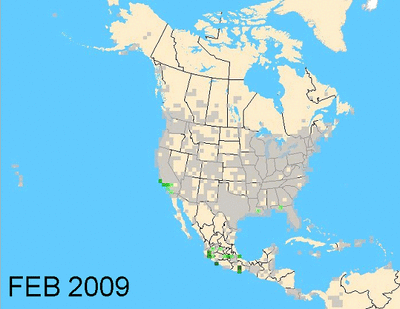
Bullock's Orioles are one of my favorite birds to see here at Avimor between May and August. I'm especially amazed at the bright orange males. Today I was wondering about their migrational movements from their wintering grounds in Mexico up toward Idaho. To satisfy my curiosity, I went to eBird and pulled up monthly maps during 2009 to see how the Bullock's Orioles distribution changes from month to month. I saved each map and loaded them into an animated GIF for ease of viewing. Pretty cool, huh?
So, what conclucsions can one draw from what we are seeing in the animated maps?
It is pretty simple to see how Bullock's Orioles come up from Mexico and spread across the western states increasing gradually in February, March, and April, then exploding in May.
I found the map for June interesting as it compares to the map from May. The distribution thins out a bit. I think this may be due to one or two things, or both:
(1) lack of eBird checklist submissions during the month of June and/or
(2) the Bullock's Orioles have settled into their nesting areas by June so their populations have condensed to those areas. The darker green areas indicate higher densitities or frequency of reports, which are still high in June, just more localized.
Then in July and August we see the populations thinning out again and the Orioles really seem clear out between September and October.
What are your thoughts?

No comments:
Post a Comment